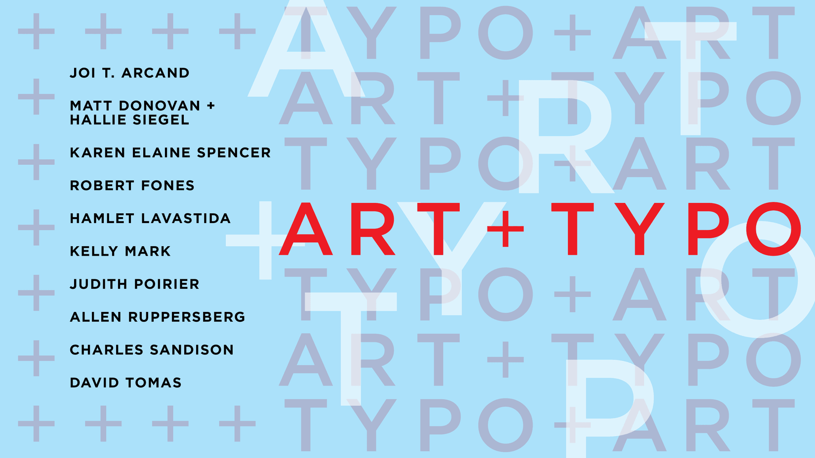
ART + TYPO
2024.02.23 - 06.22
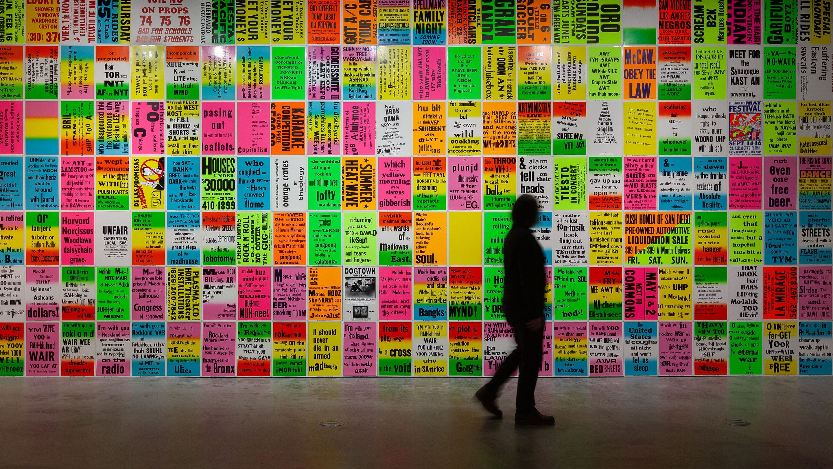
VOX and the Centre de design de l'UQAM have joined forces to present a major exhibition on art and typography, especially developed by Angela Grauerholz and Robert Fones. Both artists have a longstanding interest in the history of type, in novel experimentation, as well as in art and design. ART + TYPO (ART + TYPE) focuses on two disciplines primarily utilizing the mechanically reproducible form of letters, omnipresent in contemporary society through advertising, signage, posters, magazines and digital projections. While the exhibition spans various disciplines, its primary concern is on typography as a form-giving and expressive art. ART + TYPO is fundamentally propelled by research, experimentation and a deep connection with language, materiality and diverse design forms.
The exhibited works represent diverse and significant art practices involving typography. They reflect the living character of letterforms underlying their variations, initially used by artists in the early 20th century and becoming integral in Futurism, Dada and Russian Constructivism. In the 1950s and 1960s, Pop Art saw another resurgence of type in art as artists integrated advertising and signage into their work. Conceptual Art, appropriating methodologies from non-art disciplines and utilizing literary, political and philosophical texts, played an influential role for the majority of the artists in the exhibition.
Introductory notes to the exhibition
By Angela Grauerholz and Robert Fones
Typography can be defined as the mechanically reproducible form of letters, stemming first from Gutenberg’s invention of moveable type (1452). However, it can also be described as a form-giving discipline which evolved to expand the visual qualities of letters, words and text. As such it lends itself to enhancing the reading experience, becoming a real tool to promote potential meaning in traditional type-based media and the visual arts.
Historically we can look back at several intensely experimental periods of production with interdisciplinary tendencies. Type was first used by artists in the early 20th century as Picasso and Braque introduced stenciled letters into their paintings, using industrially produced metal stencils. Since then, artists have incorporated type or lettering into their paintings, collages, sculptures, prints and films. As well, artists and poets have explored the application of type within print media, inventing new forms of typographic expression and giving rise to cross-disciplinary practices.
It is easy to recognize all kinds of media and disciplinary crossovers involving type within recent visual arts practices. Robert Indiana’s legendary sculpture LOVE (1970) initially took form as a work of visual poetry (1964), then as a Christmas card (1965), before being made into a three-dimensional logo, first in aluminum then in steel, and remade as mass-produced keychains and postage stamps. In 1987, General Idea reworked the typographical design for an AIDS awareness campaign, replacing the word LOVE with the word AIDS, first in painting, and later in print media, wallpaper and poster form.
Notably, some of the early developments in typography were likewise generated by political interests—ideologically motivated experiments that also gave us one of the first models for using more than one discipline simultaneously. For example, in 1923 the poet Vladimir Mayakovsky and the designer and artist El Lissitzky collaborated on the design for the book For the Voice. Conforming with state-sanctioned directives, their task was to find a way to translate oral presentation—until then the only way to communicate poetry to the masses—into visual signs understandable to a mostly illiterate population. In contrast, the politically pacifist DADA movement resorted to attacking language in order to disrupt and undermine traditional attitudes in society and art.
The first break with traditional presentations of text, however, can be attributed to Stéphane Mallarmé, who in the late 19th century first attempted to give a visual dimension to his famous poem “Un coup de dés jamais n’abolira le hasard.” By employing all the various permutations of a typeface and of line spacing, using white space—different for every page—Mallarmé also invented a new art of sequencing these pages. Consequently, he was not only able to show his readers how he wanted his poem to be read, but conceived of an entirely new method of traditional typesetting, an expanded textual visuality, and in the process proposed unusual textual connections, which together with the abstract content of his poem—also a novelty at the time—created an unprecedented coherence of content and visual impact.
Visualization and communication, translation or transformation and coherence of content and visual effect are still the primary motives today for using language in a visual medium. Each artist in the exhibition has their very specific way of using language and type or lettering. Their works therefore obviously represent only a small portion of the varied and significant art practices involving typography, many of which have led to real innovations in the use of textual media.
One of the more fascinating discoveries in the selection process was the recognition of connections between the very different art practices incorporating language, political engagement, exhibition design, and expanded forms of poetry—and even typographic sign making. In fact, the exhibition in and of itself brings into focus our combined interests, funnelled into the expressive form: a stage for thought-provoking communication offering a kind of discourse on language and art, as well as signs and technological changes, which today allow us to appreciate the vitality of typographic research.

